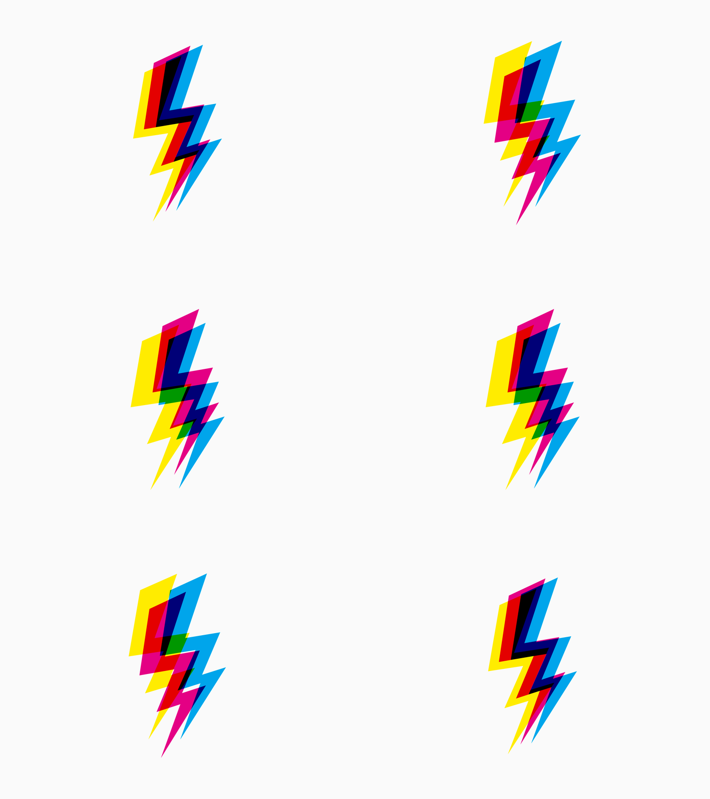
As a designer, I’ve always been drawn to the beauty of imperfection. When I first stumbled upon the concept of glitch art, it felt like a revelation. This aesthetic embraces errors and distortions, creating something uniquely captivating. I remember experimenting with glitch effects in one of my projects, and the result was a refreshing departure from the polished interfaces we often see. It made me realize that embracing imperfection can lead to memorable user experiences.
Glitch design can evoke nostalgia, reminding us of the early days of digital art and technology. I’ve found that incorporating intentional glitches in my designs invites users to engage with the interface in unexpected ways. For instance, when I designed a website with glitchy animations, users were intrigued and spent more time exploring. It was a fun way to break the mold and challenge the conventional notion of what a user interface should look like.
Moreover, embracing imperfection can enhance authenticity. In a world where users crave genuine connections, glitch design can humanize digital experiences. I’ve noticed that brands that adopt this aesthetic often convey a sense of creativity and innovation, appealing to audiences who appreciate originality.
Ultimately, the art of glitch in UI/UX design offers an exciting opportunity to push boundaries and create engaging experiences. By embracing imperfection, designers can craft interfaces that resonate with users, leaving a lasting impression that sets them apart from the competition.
Applying Kintsugi, the Japanese Art of Mending, to UI/UX Design


