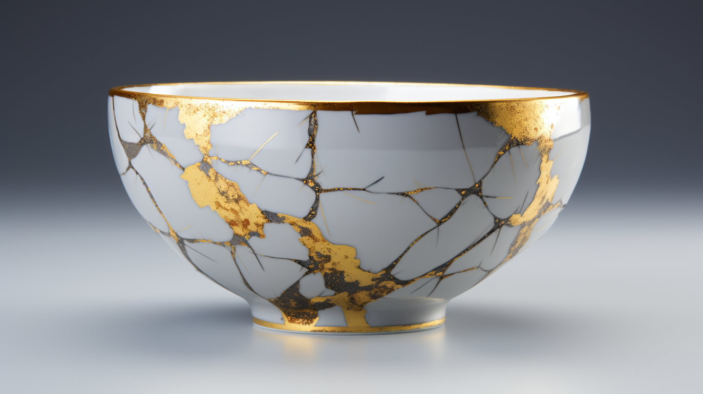
When I first learned about Kintsugi—the Japanese art of repairing broken pottery with gold—I was struck by its profound beauty and philosophy. Instead of hiding imperfections, Kintsugi celebrates them, turning flaws into features. As a designer, I realized that this concept could be applied to UI/UX design in a meaningful way. It’s about embracing the journey of a product and highlighting its evolution.
Incorporating Kintsugi into design means acknowledging the history of a product. I’ve found that when I showcase the updates and iterations of a design, users feel more connected to it. For example, if an app has undergone significant changes based on user feedback, sharing that journey can foster a sense of community and trust. Users appreciate knowing that their input has shaped the product.
Moreover, Kintsugi teaches resilience. Just as repaired pottery becomes a unique work of art, interfaces that adapt and evolve can create a more engaging experience. I’ve seen brands that embrace user feedback and iterate on their designs foster loyalty and trust among their audience. It’s a powerful reminder that imperfections can lead to growth and innovation.
The art of Kintsugi offers valuable insights for UI/UX design. By embracing imperfection and celebrating the journey, designers can create authentic experiences that resonate with users and enhance brand loyalty. So, let’s take a cue from Kintsugi and turn our flaws into features.


